CLEAN SWEEP
Project Detail Form
Primary Specialty:
BRANDING SYSTEM
Support and Logistics:
Chinese Ink Brush, Adobe Photoshop, Adobe Illustrator
Remarks:
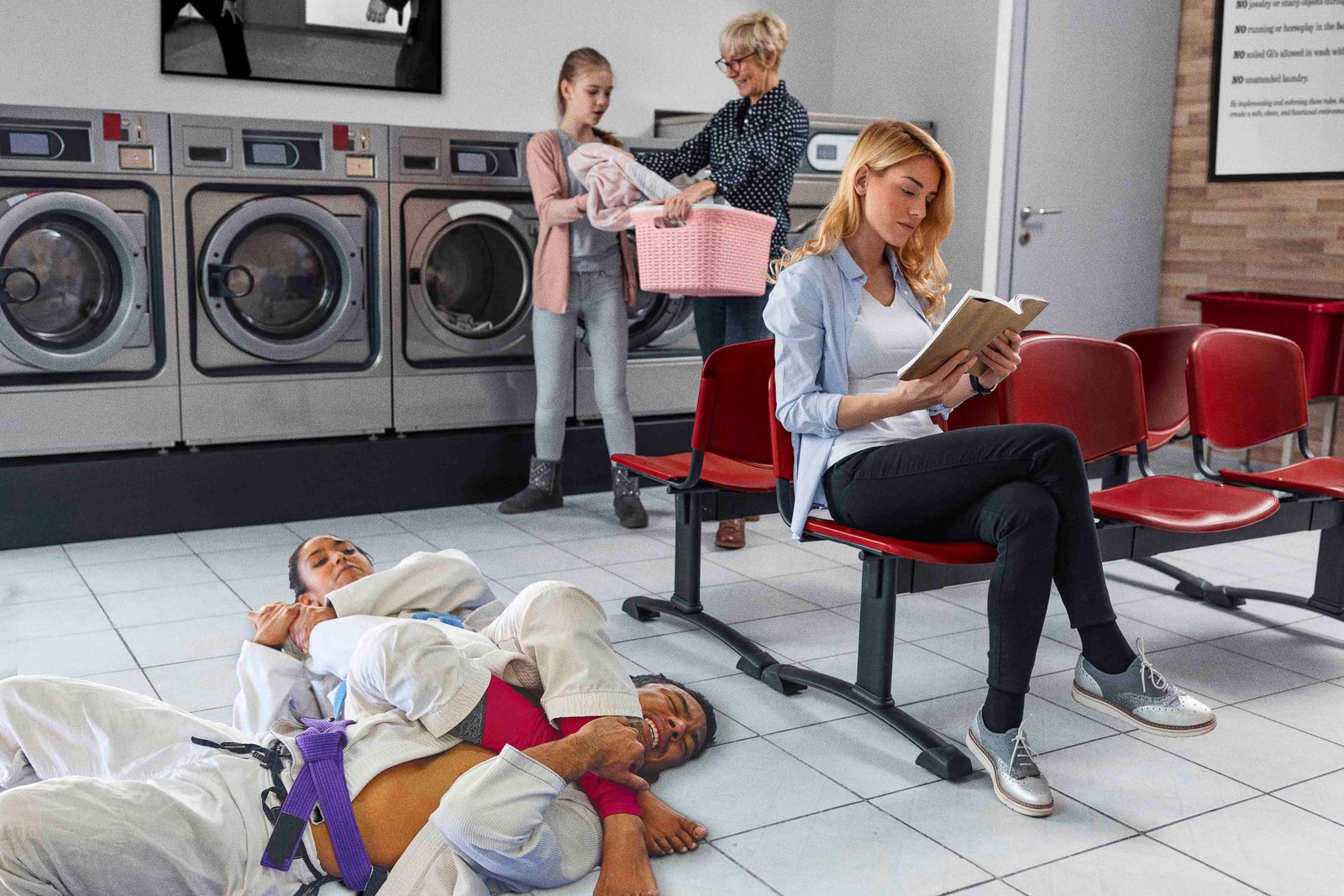
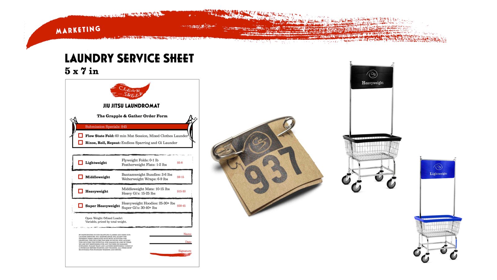
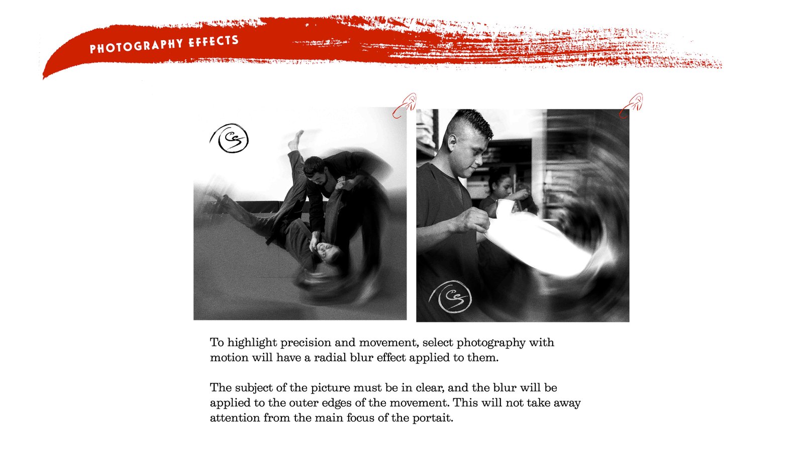
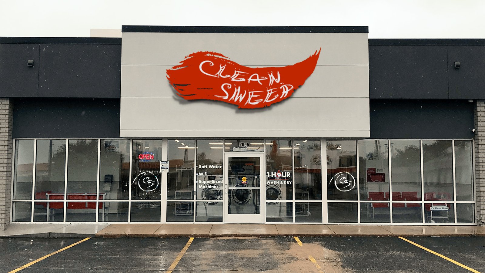
We were tasked to design a Brand Identity for a storefront that encompasses two different businesses in one. My imaginary business was a laundromat and a Brazilian Jiu-Jitsu (BJJ) dojo. This idea plays on the BJJ saying about “folding clothes with people still in them.” The logo and name were hand-painted with a Chinese ink brush to capture the fluid motion of both BJJ practice and a washing machine. The laundry cart’s color is associated with the weight of the clothes, reflecting the belt system in BJJ.